 CoalesceIdeas Web and graphic design ideas for inspiration

Web design trends come and go, with some successes, such as flexible frameworks, and some flops, such as full flash sites with unskippable intros. 2013 has seen quite a few Web design elements that improve user experience, expand interesting features for Web developers, and start pushing the capabilities of HTML 5 to its limit. Here are a few up and coming Web design elements that you should consider the next time you’re building a website:
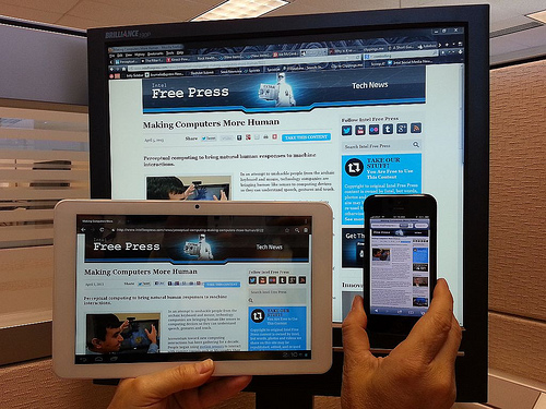
Designing for Small Screens
56 percent of mobile phone users have smartphones and the number of people browsing websites on their phones continues to rise, according to Forbes. Some Web developers have turned to responsive design to address the small screen focus without having to design an entirely new site. Others have shifted their design philosophy to put a focus on touch screen experiences and a smaller screen resolution. These sites are built with the assumption that someone with a touchscreen, instead of a mouse, is going to be browsing it. Smashing Magazine found that many developers assume that a user is always going to have a mouse available, and they miss out on prime design opportunities.
Retina Support
While the hardware of iOS devices is comparable to competitors, one area that Apple always stands out in is its display. The Retina display has twice the number of pixels in the same display size as other smartphones, so graphics are crisp, rich, and beautiful, according to Hongkiat. However, you do need to specifically design around Retina displays by creating a set of images specifically for iOS devices. This does, however, increase the load time of your site, and some users don’t have access to a high speed Internet package due to their location, according to Internet.Verizon.com.
App Style Interfaces
Minimalist Web design has always had a strong following, and the popularity of app-style interfaces helps to expand this particular trend. Instead of taking desktop users away from a simple, information-filled design, these sites emulate app interfaces on the big screen. This gives mobile users a familiar feel when they switch back and forth between devices, and it works out better than you might expect on the bigger screen.
Infinite Scrolling
AJAX is used in many applications, but one place where it’s seen most often is for infinite webpage scrolling. Sites such as Reddit, Tumblr, and Google Images use this content loading technique to improve the stickiness of their pages. Users don’t have to provide any input in order to continue seeing the rest of the site. This is used to particularly good effect on online stores, where you keep the customer looking through page after page of products until they finally buy.
Single Page Web Design
Another subset of minimalist design is the single page websites. Instead of breaking everything into different sections, such as on a project page, the single Web page is laid out in such a way that all of the content is accessible and easily digestible.
Creative Commons image by IntelFreePress

