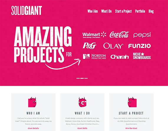
Typography is and advanced field where people devote their lives in this ancient craft. But here you can get many things to explore and learn. In this article, you can able to know about the major and important points, which you should be keeping in mind while writing. For typography, you must design the web in a way so that you can change the content according to the need. It is simply not possible to kern each title. Nowadays typography has become practical typography. In this, you cannot have total control over the kind of website.
Choosing Type and Size

You can decide the type and size of the content. Practical typography can help you in learning and have control over the matter. It is also important to know about the adjustments. Sometimes it becomes very difficult to read because of the type. Many of the websites make it very difficult to read. They put tiny font with a minimum of sizes or crammed lines with different ugly or stylish fonts. It looks like they neither want to sell their product and services nor let the readers enjoy the content. They make it seems as if, they have made the websites for the aliens.
Readable content can make you ahead in the competition from other web content writers. You will be already the winner of half the battle. But it is not at hard to make a readable content. You just need to focus on the font type and size. While deciding the typeface of your website, you must not over think about it. Many designers even hate to use Helvetica, because they think that it has been overused. But if you do not use it, how it can be overused? Maximum designers think in the same way, and Helvetica is becoming underused.
Basic Concept of Typeface

It is also true that Helvetica is used in many websites, but the reason behind that is Helvetica is very good. It can be placed in any design. It works great wonders in both small and big sizes. It can even go against your belief, but if it works, and then it is the best option. It is the fact that, you will want that your article body must be readable and also goes well with the design. So it is very important to pick the correct font which works even in the small sizes.
You can even try font in 10 px and even after that if you can read out the content, then it is a very good indication that you have chosen the right readable typeface for your website. But for titles, it must be larger than the body. Title represents the content of the body so title must be attractive and easy. The good thing about typefaces is that if you work on many projects, you can easily make out that what looks good or not. By this, you can able to make critical and important choices about fonts.
Formula of Good Content
There is no specific formula for choosing the correct font for your website. Sometime many people try out all fonts to see and compare the look of the font in the website. You must choose the font according to your gut instinct. But always remember that 90% of people choose the font only with the look or the style of the font. Style of look is secondary, but the most important thing is that the content must be readable. Rarely does it happen that one typeface is good enough for the website. Average websites have many texts.
Pairing With the Typeface
It is not true that typeface will work all the time. Maximum websites use to kind of typeface, one for headlines and one for the body. When you choose the pair of the fonts, you must always consider the combination of the fonts. You have to think that are they looking very similar or not similar or totally different. These are very important questions, which you have to know the answers. The best way to choose the pairs is that you can put them side by side and see the similarities and differences. Without trying, you cannot judge any fonts.
Most Appropriate Fonts
Sometimes you can find only appropriate fonts are sans-serifs. Some use sans-serifs in the header and some use it in the body. Even many people use sans-serifs in both and header. But it does not look at all bad, and it also does not matter all the time. The rest depends on the design of the website. Actually the font is important because it conveys the message of the content. Sans-serifs can also be used for main and small titles. This also helps to display the message of the content of the website very easily.
Expressions of the Fonts

Fonts individually cannot express the meaning of the content. But designers specially want to us 12px as the size of the font for their body. Some even choose 14px for their website, which give even more readability. It is easy to choose font size for the body, but for the title, it is little difficult. Title depends on the creation and observation of the website. But a title must be as big as the content demands. You can try out different sizes until you find the suitable size for the title. The important thing is that the title must draw the attention of the people.
So you can understand from the article that content is the king for a website. The title, font size and style, everything depends on the content. They are very important part of the content. Typography includes all aspects. A title is the main attention drawer of the article, and it can be big but not huge. Even color, placement and weight are also very important for creating visual hierarchy to the web pages. Title can even become small, but it must be catchy. But when you use color on the title, it gives them the meaning and importance.
Author bio: James is an experienced web designer and working with a group of Magento programmers. He has shared articles related to font and how to use the right type of fonts while working on web. He currently lives in California with his wife and a son.
 CoalesceIdeas Web and graphic design ideas for inspiration


2 comments
Pingback: Choose The Right Font: It Is A Practical Guide To Typography On The Web | Design News
Pingback: Créa | Pearltrees