 CoalesceIdeas Web and graphic design ideas for inspiration

No one can deny that the future of web will be a responsive web. At present, everyone practically has smartphone, tablet, iPhone or other mobile devices to access internet and social networks. So, what we need to adapt as a website designer or developer? We need to build our website design responsive and adapt the responsive features of HTML5 in order to increase visibility of site.
What is Responsive Web Design?
Responsive web design or RWD essentially indicates that your website is compatible to open on different mobile browsers. The layout of page and images can access with content. As the result, users can access your site across the world with a broad range of mobile devices as well browsers and easily can read the content. Resizing, scrolling, panning, all with the navigation can be done effectively.
Basically, the responsive web technique responds in different browser environments, like – if you browse any site by using computer or desktop, you will get a full view, but with a mobile browser, using smartphone responds to this site and adapts the width of the page to match with the size of the mobile device.
We have catered previously many blogs with the examples of responsive web design, even this is the awesome collection of 10 responsive sites of 2013 at your glance. We hope that it will give you an inspiration and spark some innovative ideas of your own to use in the next project. Feel free to give the suggestions and share with your friends or co-workers.
HTML Panda

HTML Panda is a very simple and interactive responsive website design that effectively manages images, content and layout with slider effects. You can easily enlarge the size of images and content according to your comfort.
The Boston Globe

Although a large amount of content is passes on the daily basis through the Boston Globe, yet this website is well-managed and organized. One of the pioneer news media responsive websites, it consistently provides stunning examples of companies and showcases how they can optimize web pages, viewing experience across the globe to attract a wide array of visitors. Easy to access news site has cool layout.
Design Week Portland
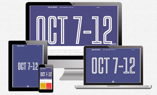
The designer of this site understands the importance of multimedia and offers a warm, personal welcome to its prospective visitors to showcase their artwork with the help of sliders. The clear navigation with multiple color scheme makes this site really cool, attractive and give appreciation to designers for expert crafting.
No-Refresh

With navigation, slider effect, simple layout and graphics, ìNo-Refreshî is one of the popular responsive websites. It can be easily accessible on iPhone, smartphone or other devices for all the stunning features. This site is well-executed with user-friendly & interactive images and sliders.
Harvard University

This website is well-organized and has a classic and simple design. You are unable to find out the conspicuous logos and loud color schemes here. Use of just tasteful colors and concise on the headlines. The layout and design of site is perfectly fitted and clearly explains the difference between design and layout.
The Creators Project

The creators project is clearly embraces the multimedia channels through visible listing social media platforms, unique and retractable header. The use of a prominent introductory video is perfect at the home page to make this site interactive. The functional layout skillfully builds a platform to be displayed highly visionary art.
PSDtoWordPressExpert

The simplicity is a key for a professional look and PSDtoWordPressExpertís website is one the best examples, which mainly focus on the content rather than too much images. They aim to provide all the relevant information via content, few attractive images and navigation.
An Event Apart

An Event Apartís website comprises clean aesthetic and tactfully bold images to attract visitors and desperate to inquire about the unique offering services. We can say that this site has strong visualization and clear descriptions & in fact, their events with responsive website design are well executed and audience-friendly.
HTC One

The ìHTC Oneî is amazingly displayed every stage of browsing and the stimulating graphics are outstanding and widely interactive with responsive design. As you click through the website, it pulls you deeper inside, this feature is giving a vibe that this technology never short of cutting-edge. The forwardsí thinking responsive design clearly focuses around the product.
CSSChopper

The CSSChopperís website has a simple layout and graphic design, yet very attractive and the professional look is capable to catch the niche audienceís attention. This responsive website design makes easy for users to read the content easily. The effective resizing and scrolling features are used for viewersí convenience over mobile devices as well.
Garry Smith is a professional website designer and highly focused on responsive design to enhance the visibility of site. He is associated with Webgranth. At free time, he loves to write blogs, this is why he has served many blogs on a regular basis.

