 CoalesceIdeas Web and graphic design ideas for inspiration
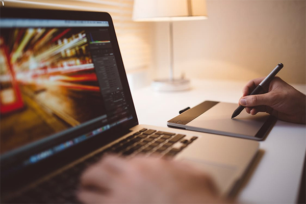
Brilliant visuals have always been appealing to the human eye, in whichever form they might exist. Adobe Illustrator and Adobe Photoshop are the two most preferred programs that designers prefer to design with. Not only do these software programs give clear visuals of the image that you are designing, but they can be highly detailed and intricate. However, this leaves developers to have a lot of difficulties to work with. Not because the designs are complex or that they require complicated coding, but because of how they will look in HTML format.
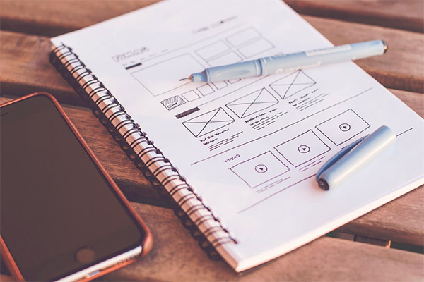
There is a difference between designing a proposal on these creative platforms and actually implement those styles. A closely related practice of pixel design was of pixel art, which has existed even before the internet and was designed for games. But those were simpler times and no one had Photoshop and Illustrator to provide an idea on how the final outcome may look like. But now those layouts provide the basis of what a page can look like when composed for HTML. The struggle to make the final product look like the designed draft has always existed for coders, and here are the reasons why the outcome doesn’t match the proposed idea.

Image Sizes:
The biggest hurdle for an HTML expert would be that the sizing of the image from a PSD format to an HTML format. A designer may have designed the image that is over 2000px wide, but most users use devices that are not able to display that big images, so it is a fruitless effort on the designer’s end. There are multiple sizes that fit easily on most browser devices. There are java scripts that have the ability to automatically transform the web page according to the user’s screen settings so the whole picture shows up on the screen. However, depending on those applications always is not the option. So if a designer has designed a logo keeping the newest trends in mind or created a picture with unnecessary big dimensions then the developer would choose to tone down the dimensions of the image.
Colors:
The color profiles of the images that you post have the tendency to be of a different setting than the one they are going to be displayed on. CMYK is set for printable images, while bitmap images are low in quality and used for taking small spaces. The safest bet is to be working on an sRGB setting so that the picture’s colors are perfect when it is uploaded on the web. It could be a designed logo, or it could be a picture taken professionally from a camera, a color profile matters. If the mode is any other than the suggested profile, then it could produce a different result that was expected.
Font Sizes:
Font sizes matter just as much as the design and pictures on a website. Which is why if a designer is writing from a perspective of their own computer screen then it could be at a different display size than what the website is developing at and the size that the audience normally uses. A developer is the one sees to that problem and adjusts the size of the fonts so that they fit the whole page not just the design. The most suitable font size for any readable text must be at least 12px. Headings can vary in sizes but not must be too big that they fit the whole page without leaving a negative space for the characters to have a breathing space, or too small that they can’t be differentiated from the body copy.
Responsive designs:
Another important aspect of a website is that it must be responsive. If the theme is too heavy for the web to load in few seconds then the website’s traffic may bounce back before even letting the first page open completely. Even though designers take care of the designing aspect and try their best that the theme is perfect down to the last pixel, it is the developer’s job to keep the pattern practical. The developer not just has to keep a laptop or a desktop in mind, but create a responsive site that can work on a tablet or a mobile as well. It is also possible that the website creator would want to minimize the composition, so it can support HTML5 format, making it easy for the mobile app developer to produce an app which is supported by all smart mobiles. This becomes the reason why the webpage may have a slightly different aliasing settings than the ones proposed by a digital artist.
All these steps make up a great website layout. A designer is there to make the website look good, yet the developer is always the one who has to adjust to difficult situations if the design is incompatible with the UI. Hence the designs that a website has are not always exactly the way that they were intended to be.
Author Bio:
Carla Adams is an enthusiastic dreamer and a workaholic to achieve that. She is a blogger, writer, basketball player, technology and fashion freak. For all the updates follow her on Facebook.
