Typography was often overlooked as a major component of design by designers’ years ago and was considered only secondary to images or illustrations. In this decade, however, typography is slowly getting the spotlight it deserves. Even sometimes replacing images and illustrations altogether, typography can now be seen as the only element present in a print banners, brochure printing piece or web design. The other way to promote your business is by using Posters. It’s the old way but still very important in your brand marketing strategy.
A poster is a printed based design and typically includes both textual and graphic elements, and one of them – graphic only/text only. However, you can use only type to create breath-taking designs. And in fact, many graphic designers, artists, and clipping path service providers take exactly this route to communicate their ideas through their works.
In this article, there is an easy as pie step by step Typographic Poster Design Tutorial to follow. Some are intermediate and the other are slightly advanced but you’ll learn some typography techniques to help you in designing your own posters.
Using simple shapes can produce some great looking contemporary designs that fit well as impactful posters; a good example being the recent Trendy Geometric Line wise is one. This time we’ll look at stripping back the tools to creating an interesting and eye-catching poster with a single typographic word.
STEP 1

Find a random image to base the design on, the subject of the photo isn’t at all important, just choose a picture with varied contrast and preferably tailored towards your chosen color scheme. In this case I’ve picked out a landscape scene with a mix of RBG.
Step 2
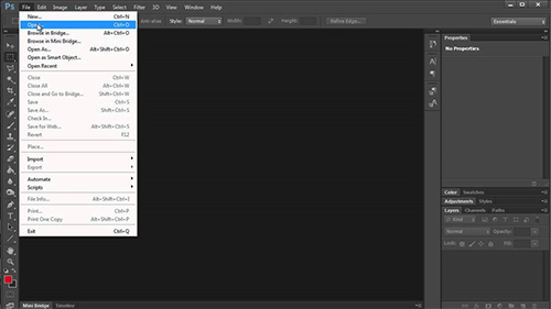
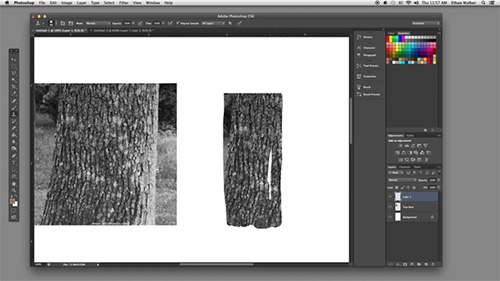
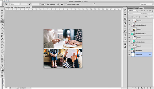
Open up the image in Adobe Photoshop and resize accordingly
STEP 3
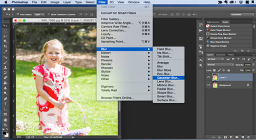
Go to Filter > Blur > Gaussian Blur, drag the slider almost all the way to the maximum to completely disguise the original subject and blend together the colors and tones.
STEP 4
Head over to the sites that give you high resolution textured images and download one of the free high-res textures. Place the texture on a new layer in the Photoshop document.
STEP 5
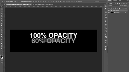
Desiderate the image then change the blending mode to Soft Light and drop the opacity to suit, adding a little detail and roughness to the image.
STEP 6
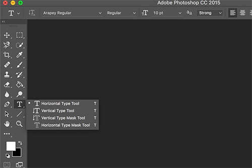 With the Type Tool, write out your desired wording. Of course, I have chosen this one https://vbaadmin.deviantart.com/art/Typography-Poster-Design-146487224
STEP 7
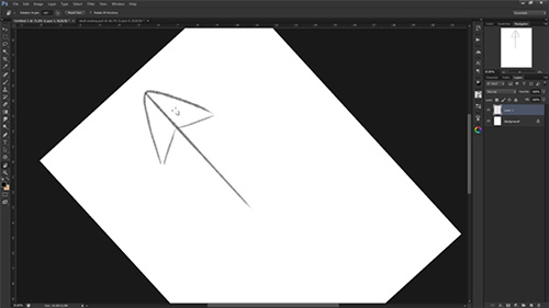 Rotate the block of text to 45 degrees (hold shift to constrain the angle). Set the blending mode to Soft Light to allow the underlying texture to show through.
STEP 8
 Position the text to encroach onto the document covering the top corner. Whilst holding ALT drag a copy of the text and scale into a new position.
STEP 9
 Hold the ALT key and drag two more copies of the text, resize them and position to fill out space on the document.
STEP 10
 With the next copy, rotate the text by 90 degrees leaving it perpendicular to the other variations. Move the text into place leaving the same gap between the other text objects.
Step 11
 Create more instances of the text and rotate and scale into varying positions, ensure that each block aligns to the diagonal gridlines of the composition that are being formed.When gaps appear in the document, visualize how the word can be scaled or rotated to fill the gap whilst aligning to the gridline and leaving the same gap around the objects.Also take into consideration the spread of large and small instances of the text to ensure that the sizes are varied without clusters of similar sized objects creating an unwanted focal point.
With multiple copies of the text being scaled and rotated into place the document is now completely filled.
Make any final tweaks to the poster such as altering the overall layout and making small edits to the individual objects, leaving a trendy poster design based almost solely on a typographic layout of a single word if you want to.
Also here are three cardinal tips once you know the basics in order to start:
Make an impact
 I like to follow the trends, but do not usually apply them to my designs. I like minimalist design and simple lines. I try to convey what I want with a few elements that make an impact and have a lasting message.
In other words, before you design a poster make sure you have a good idea, so it will not only appeal to designers due to the aesthetics, but will also appeal to fans through the focus.
Be consistent with details
Consistency of detail is key to a great poster design. This next piece of advice is especially important if you’re doing a collectable series for example movie posters – that details should be consistent.
 I’m primarily a graphic designer so I’m used to working with fonts. I choose the same font for the titles of all the series for consistency. And I use a contrasting font for the detailed information accompanying the car. But for me, just as important as the font is the background color. The background color I chose was based on what I felt the film symbolized and what would combine well with the other elements.
Choose references carefully
Not going for the obvious choices will help your poster design stand out. We observed that there were many people making alternative posters but I tried to give another approach. As I wanted to create a series, which I’m still working and I hope to grow, but not only legendary films, but also TV shows that I admire and where cars are not as well known.
My process for this project was as follows: I did a sketch and then vectorised using Illustrator. My references were obviously the pictures of the cars and watching the movie. I didn’t go into too much detail – analyzing particular frames – for example to see what was on the label hanging on the chair of the Mr. Bean car. It’s about balancing artistic interpretation with authenticity, in this case.
 The backbone of a great poster presentation is about stepping into the different worlds of interest and adding them to the creative worlds. Therefore you’d want a focal point, albeit a bit abstract, to be a huge “capital letter” which is fragmented to symbolize everything that goes on within one discipline. The other colored fragments represent the outside influences. Before print supply, then added white border within the canvas to make elements ‘spill’ out and once again emphasize the crossover of ideas and styles. The lesson here is to draw your composition ideas from the theme your design around.