Last month we have featured 13 top website alternative look. Those design where designers expresses on how they would do the project when it is awarded to them, my favorite was the Facebook design project. Today, we will have a look at the new design of Yahoo.com.
It seems to me like Yahoo! is trying to be more like Google in design. I personally think that’s a mistake. Yahoo! seems to be more of a news, entertainment brand. They should embrace that more and have fun with photography and type. I mean, seriously, they could have tons of fun with the editorial over there. Yahoo! could easily become the ultimate news site.
Anyways, in celebration of launching my latest project, PSDs.co – a place for designers to download Photoshop files I’ve created, I wanted to test for myself how hard it would be for Yahoo! to do something drastically different — something unique, memorable, simple, but not Google simple. Not even a handful of hours later I was able to create these two designs of what I would have liked for Yahoo! to reveal.
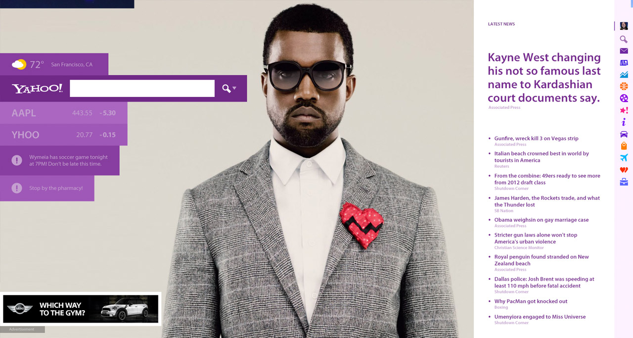
The Homepage
Yahoo! is a entertainment/news source site. Don’t think of it as a search engine. However, at the same time, don’t count them out, either. It’s still a staple in their business. With my version of the homepage, I wanted it to be fun and personal. This comp below is showing what a logged in user might see when they land on Yahoo.com. Here’s a larger view.
It features a full browser width design. On the left, you have a few personal items such as your local weather, your favorite stocks, and even a few reminders that you left for yourself or that automatically show up through your Yahoo! email account. Of course, I needed to throw an ad in. Yahoo! has to make money, you know. Plus I didn’t want to cheat on the design either, hehe.
On the right, are new Yahoo! navigation tools which when clicked, change what appears to the left of them. When you first land on Yahoo.com, it’ll show the top latest news on the right. The big background image of Kanye is the featured news article. This featured area could be a big $$$ gainer for Yahoo! Imagine if MINI Cooper came out with a new car. They could pay Yahoo! the same cost as a Super Bowl ad to display it there. MILLIONS! (ideally for logged out users landing on yahoo.com.)
A cooler experience so far, right? Good. That’s what we’re after here. Something different that will make a user stay longer than 2 seconds to check out a redesign — something unique enough to want to explore.
Ok, now just to show how nicely the rest of Yahoo! fits into this design, I quickly mocked up a version of how search might look. Here’s a larger view of the search.
Just as you’d expect, more big beautiful imagery! To the middle, you’ve got the search results in a white column and a column of images and video beside it to the right. Anyone else hate to click “images” to see images? Yup. I didn’t think I was the only one. The first image could be the featured image that shows up on the left, unless Yahoo! could do some magic here with their talented engineers to make sure that image is always epic. Can’t be that hard, right Google…oh I mean right, Yahoo?
Notice two details here:
The search box never moved from where it was on the previous page.
Also the indicator on the right navigation now shows you’re in search mode. Nice, subtle details go along way.
Download the FREE Yahoo.com PSDs for this project over at PSDs.co.
Original article can found via thetechblock and gizmodo
Nice technique..really useful…thanks for
the post…
Very Good Post really fantastic.