Graphic Designers may have different backgrounds. some might take professional training of graphic designing while others tried to learn it from themselves. If you are the new graphic designer and need some tips to enhance your graphic designing skills, then you may continue to read.
Here is a list of 10 tips as well as relevant resources to assist you in taking a quick start on your design journey. These tips will be helpful;l to you but it is significant to know that it is up to you to be a brilliant graphic designer you always wanted to be. It takes a lot of time, tolerance and consistency to be a really good graphic designer. But once you learn the skills of good graphics designing it will stay with your forever. Moreover, the idea is to enhance your skills with practice and build good design aesthetic skills with time. Lastly, it is important to remember that practice makes your skills better.
1. Get a correct Font

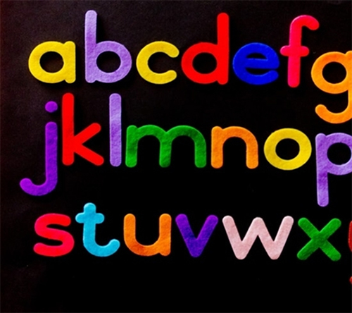
Clear design and readability are significant. It is important not to limit your designs to one typeface only. Professional graphic designers use various types of fronts and stay with the different font style for the recent project you are concentrating. You must explore various opportunities rather than just picking the same default fonts.
2. Use bright colors

If you want to grab the attention of your user at first glance, a color pop technique is the best. Especially, when you don’t have much text and you want to create a good impact on your users. High contrasting palettes such as yellow and white or black, red and black with bright background color can be perfect. if you want to grab the attention of your user at first glance, the color pop technique can work for you. It makes the most impact when the text is short and you want to create a huge impact. High contrasting palettes like yellow and white or black, red and black along with the funky colors will look good. The cohesiveness of design also matters and put an ideal impact. Professional logo designers can help you in choosing a good palette for your design.
3. Use white space for simplicity
White space is significant in graphic designing trends where the portrays simplicity. While writing a text on big canvas, choose a greater quality font and keeping it in the center and keeping the remaining on left white. In this way, the canvas will look better.
4. Choose persistent pictures
It is important to make sure that the quality of pictures stays absolutely persistent within your design. The quality, framing, style, proportions, and lighting of those features should remain static within your design. The graphics, diagrams, pictures, and illustrations that you use should make your project even better.
5. Scan your design
If you are creating your design, it is important to scan it on your computer. You can also take advantage of the smartphone camera to do it and get the scanned copy into the illustrator or photoshop directly. You can create your own design normally, but you need to use the scan copy as your background guide.
6. Flat design is good to use
Flat design has been very famous over the previous years as its design is more classy than bright. You should focus on the alignment and spacing while using flat design tactics where it will look more good.
7. Use character and paragraph styles
You need to choose your header carefully and implement its style. Headers are somehow in different positions along with various typefaces or line sizes. Tools like Indesign and photoshop have various tools to ensure that your words and paragraphs have an ideal cohesion among them these tools can keep you from continuous scrolling between pages, therefore highlighting and analyzing to ensure that your styles are placed in a proper way.
8. Use italics correctly
You also need to use italics in a few of your projects to have a good effect. They should be implemented with immense respect as they can help you to balance your headers in subheaders. Italics must be used in short sentences only. Professional graphics designing company like logo experts can create some good graphics designing piece of work.
9. Icons can be helpful
Icons are very important for your design. They can add value to your design whatever you are creating. It will surely look perfect when you add it in your design. Web designing agencies always fog extra miles to make their designs look good. This tip can add value to their strategies.
10. Use separation lines
Using line distinction for an exact piece can bring in a modest piece up to scratch if you are striving to make it seem done. Fro solid line, you should use half lines on either side of a short text filament. The 3-pixel line above the sub header, or between the picture and the heading, will make your work look good and will be successful in the long run. Hope these tips for graphic designers will make them improve their designing skills. Using line separation technique for an accurate piece can bring you a modest piece up to scratch if you want to make it look complete. You can use half; lines in place of a solid line on each side of a text thread. Using a 3-pixel line below the header and above the sub-header, or between the image and the title can also make your work look good and successful in the long run.
I believe the above-discussed tips can help beginners to create unique designs for their websites.,
Natalia Strzelinska is a professional writer and working with one of the leading Logo Designing company, LogoExperts. She loves to read books and write on different topics related to Designing.
 CoalesceIdeas Web and graphic design ideas for inspiration


